CMP Unveils Updated Logo Design
May 20, 2025
The Civilian Marksmanship Program (CMP) is excited to announce a rebranding of its logo – moving from the classic eagle seal to a new, simpler style.
“We believe it is time for new logo that represents the more modern current state of the CMP – something that, like the revision of our programs, is more contemporary,” said CMP Board Chair and CEO, Jerry O’Keefe. “We couldn’t be more proud of CMP’s deep history and legacy which stretches back over 120 years and the classic eagle seal will always represent and be part of that. CMP’s brand in the firearms and marksmanship competition space is growing so it is the right time for our logo and the brand it represents to evolve as well.”
The Civilian Marksmanship Program’s lineage began in 1903 as the National Board for the Promotion of Rifle Practice under President Theodore Roosevelt and the Department of War. The program oversaw the administration of marksmanship for citizens in the United States until 1996 when it transformed into the CMP as we know it today – a private organization with the mission to provide firearms safety, education and training for all, especially the youth community.
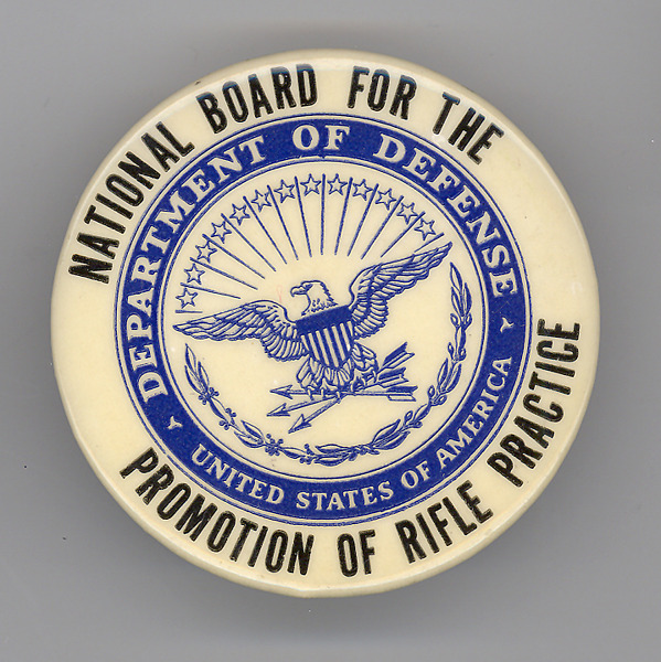
The CMP’s accompanying insignia, characterized by its eagle, stars and arrows, was derived from the seal of the Department of Defense and can be traced back to the 1960s. The seal has undergone minor changes over the years but will now stand as a historical reference to the CMP and its previous identities rather than its primary brand model. CEO O’Keefe further states, “it is the right time for the CMP to transition from the legacy seal which reflects CMP’s storied history as part of the Government to a new logo that better represents the 21st century CMP as a strong and thriving private organization.
The new CMP logo takes on a more forward-looking and minimalistic design to echo modern trends, mark the company’s singular identity all while acknowledging CMP’s strong brand awareness. The bolded three-letter emblem embodies the CMP name and is in lockstep with its ideologies: Strong, Bold, Proud, Stable, Timeless. A reticle traced within the “C” of the logo, a crosshair pattern often seen within firearm sights, directly associates the logo with CMP’s continuing mission – etching a clear focus on marksmanship.
The revised logo will now be the standard symbol on all CMP merchandise, correspondences and publications, while the classic eagle seal will be reserved only for official CMP letterhead and other special projects.
“We’re grateful for the position we’re afforded,” O’Keefe said. “That is, an audience of individuals who have supported the CMP for generations – who are able to recognize all that we stand for from our company acronym alone.”
“The eagle seal will always be part of the CMP’s legacy and will remain a profound icon for America’s marksmanship history,” he went on. “And we hope this new logo will make a similar impact as it becomes synonymous with exceptional firearm training, responsible ownership and competition excellence.”
More About the CMP:
The Civilian Marksmanship Program (CMP) is a federally-chartered 501(c)(3) corporation that places its highest priority on firearms safety and marksmanship activities, with a focus on youth. CMP’s programs encourage personal growth and build life skills, with such initiatives as its junior training and competition programs, Affiliated Club program and scholarships providing support to citizens of all backgrounds across the nation. Learn more about the CMP at https://thecmp.org/.
I agree, the old logo is far more superior than the CMP logo. I say try again.
“Stupid is as Stupid does” (Forest Gump).
PLEASE consult ie: Gary Anderson about this (& maybe everything else, before you change anything).
The second example with the Eagle and letters together isn’t terrible. — But just the letters CMP alone means nothing, to anybody.
I agree with all the above. That “new” logo looks like the oil company with the same three letters. Bring back the original.
Well, it seems this is not going too well…😳
How about using both? 🤔
I’m looking at your example of limited correspondence that use both, and I like that set up.
Sounds like the Membership has spoken……I also agree, leave the original logo alone.
It represented the symbol of our great nation right along with other treasured institutions.
Bob
I agree this new logo says nothing about this proud organization. Please don’t change!!
Keep the “Eagle” The trend to meaningless corporate blob logos is not what we are!
Wait was this an idea from Alissa Heinerscheid?
If it AIN’T BROKE DON’T FIX IT!
CMP didn’t ask, ANYONE, but let me add my voice to the crescendo: what a disgrace! The old logo was (is!) awesome, the new one is manure (and that is insulting to barn floors everywhere).
Please, about face, immediately, and stop this train wreck.
Then perhaps the committee that came up with this mess can be publicly flogged at Camp Perry during the first shot ceremony.
Please put it back to the honored eagle! 20 years as military, plus dozens running CMP matches. The old logo deserved respect. You would take the eagle away for what purpose. Tho make things simple? Change it back. This is a step in the WRONG direction
Leave the lo-go alone. Years ago the old Corps said “tradition breeds pride”, we all know they have it. The
New proposed logo has nothing. Notice the Marines have a blue dress uniform that goes back before the turn
Of the century. It works for them.
I kinda thought the sleeker seal was new and I had seen a variation of this initial one with the outline and distressed look on receipts. It didn’t look bad, especially as an alternate design for places the round logo doesn’t fit well. This one is just…. blah. Especially as a complete replacement.
Really????
Boo!
This new logo SUCKS! It says NOTHING about CMP…period! Go back and I agree with Schultz…looks like Biden got to you! And Paul Carlson is correct, you should be DOGED! And as Steve Sciarabba points out, there is absolutely NO, not a bit of patriotism involved and your wasting money to make that logo gives good reason for the increase in CMP costs! So much for the PROMOTION OF RIFLE PRACTISE.
The new logo is terrible. Please change it back to the old one. The current logo says nothing about the patriotic and military themed history of the organization. It looks like bland corporate garbage.
CMP you definitely went in the wrong direction on this one…. I suggest you rethink this on real quick…WHY would you even consider removing the eagle??? WOW….I mean….WOW??!
There is an eagle on the new logo.
I apologize Scott, but the new logo doesn’t show on my browser. I was looking at the two different ones above this comment section.
Please revert BACK to the previous logo. The new one belongs with a data mining company not one supporting marksmanship. Can we as members VOTE to change this back?
If CMP has enough time and money to waste on a “new” logo they should be DOGEd. Like other agencies you waste money on this. Perhaps you have too many employees with nothing to do so they tinker to justify the job. Very sad.
How does this new Logo represent the more modern current state of the CMP. The more modern current state of the CMP is sales, online orders and retail products. The new logo appears tech-y at best (AI), and not patriotic. I’m betting the decision maker on this never served in the military and/or no law enforcement experience what-so-ever. This reminds me of another Ft Bragg (Ft Liberty) debacle………..
Too plain non distinct says nothing about the organization and what it does. Maybe thats what was intended.
Whose idea was this? It’s unimaginative and boring; all it is is three letters. It’s as boring as “GMC”.
I thought a trademark was supposed to distinguish a company from other companies – the symbol or mark instantly forming a mental connection to the company with no confusion as to what it (the trademark) refers to.
If you want to change the logo, I think the project should be put on hold and the CMP should solicit suggestions for a new logo.
Personally, I think the logo should allude to the program’s military heritage and symbolize what it’s core purpose is.
If you were going to make any changes it should have been put out as a logo competition and get ideas and offer a rifle to the winner. I say add 13 stars instead of 8 and put crossed rifles in the National Bald Eagles claws instead of the arrows.
The new logo is a huge miss. It embodies no historical tradition and looks like a ripoff of other logos like Caldwell or Shadow Systems. Please go back to the old one.
No Patriotism in that logo.
Looks like the Biden crew got a hold of it and did like it did to military bases and the 1% trying to change the country to what it is not.
Gotta say, not a fan of the new logo. The new one doesn’t give any idea about what the CMP is or does! The C kind of looks like a cross hair…kind of. An unnecessary change, for the worse.
Strongly disagree with this change! The initials “CMP” mean nothing to the average person and will not in any way advance the public’s knowledge of the program or its purpose. Retain the old logo!
I agree with Steven Dekich MD. I prefer the old logo and the patriotism that it conveys.
The new logo means nothing. New leaders like to change logos and brand identity to celebrate their ascension to power. History didn’t begin on the day you took office, sport…
I think the CMP needs to stay with what work. The new logo is horrible. Why change something that has been recognized for years and has represented the organization very well. Change is not always good in a historical organization.
The old logo is way better.
It looks like you made a change for the sake of making change.
Why does every new CEO have to rearrange the furniture?
I strongly prefer the old LOGO !!!!! The new logo has no meaning of any kind and does not impart ANY HISTORY LEADING ALL THE WAY BACK TO PRESIDENT TEDDY ROOSEVELT!!!!! This is not an improvement in my opinion!!!
The new logo is a poor choice. Time will tell as to how many of us no longer spend money on CMP items with the logo on it. Hopefully the CMP has a plan to make up some of the revenue they are going to lose.
The old logo, to me, is much better. It gives more than a hint of patriotism and history. Makes you feel that the CMP is an organization with purpose.
The new logo just looks sterile. Gives no sense of mission or purpose. Easily forgotten. Very poor choice, in my opinion, and will not benefit the CMP in any tangible way…
The CMP places its HIGHEST priority on selling rifles to the collectors and flippers, NOT competition shooters. The DCM supported actual competition shooters.
Amen! Collectors, flippers and hoarders! LOL!
I think the new CEO should be fired. Why change the symbol with over 120 years history behind it. This is what the program was founded on. The new symbol does nothing for the public and those that support it. The new symbol looks cheap. I can’t find one person the likes it. We are starting a petition to stop the change.